Wednesday, December 10, 2008

Christmas Notes


I made these cute little gift cards to show a very quick easy card to make. They are 2.75" square using a variety of colours. The images are from the Level 2 hostess set "Deer Friends" (soon to be retired). I stamped on Very Vanilla cardstock and punched them out with the 1-3/8" circle punch and also the 1-1/4" circle punch (you can use either). With Stampin' Dimensionals, I adhered the circles onto the scallop punched coloured cardstock. These were then adhered to the card with more Stampin' Dimensionals. These fit beautifully into the mini square envelopes.

I think they turned out pretty good. What do you think?


Sunday, November 16, 2008

Open House Projects


Here are the projects we did at my Stampin' Up! Open House.

This is a Baja Breeze shaker card. I used baja breeze ink for the snowflake background with my Jumbo Bold Snowflakes wheel. The "be merry" stamp from the "Warm Words" stamp set was inked in Real Red craft ink. Craft ink keeps a truer colour than the classic ink because the pigment sits on top of the paper rather than blending with the paper colour.

The scallop frame chipboard was inked with Whisper White craft ink and embossed with iridescent ice embossing powder (may favorite for this time of year). I then made the window by stamping a partial of this flourish from the "Baroque Motifs" set with white Stazon ink on a piece of acetate. This was attached to the chipboard with Sticky Strip. The "shakees" are styrafoam filling from a pillow that Mel took apart. These are extremely staticky and get on everything, but everyone survived it!

I used foam strips that I got at Micheals to make the box and backed it with a piece of baja breeze. The 1/4" Real Red grosgrain ribbon was then tied around the box and the entire shaker box was applied with more Sticky Strip to the card.


This second project was made using the pillow box sizzix die that Stampin' Up! now offers. The box is made with Ridinghood Red cardstock and cut with the die in the die cut machine. (I still don't have my Big Shot, but it works in my Cuttlebug).
We then stamped the Classic Stripes background stamp in Ridinghood Red ink over the paper before shaping the box (Sticky Strip was used again here to hold the box together). The stamped image is from the SU hostess set "Punches Three" which was stamped in Chocolate Chip ink on Very Vanilla cardstock and punched out with SU's Scallop Square punch.
Finally, the 1/4" Chocolate grosgrain ribbon was applied and the stamped image was adhered with stampin' dimensionals.
This box would be great for candies, jewelry, scrapbook/card embellishments, and even a sweet little note. It would fit great in a stocking or even as a party favor at a wedding (with a few changes, of course).
For those of you who like Stampin' Up! products, right now you can get 20% off any rub-ons in the current catalogues if you purchase $20 of product.

Friday, November 7, 2008

Pun Fun Birthday


Sorry for the bad colour on the photo. My husband cleaned up our computer and hasn't put our photo editing program back on yet. I'm afraid my photo turned out quite dark.

I made this card for a little girls 4th birthday. The base card is Whisper White cardstock and I used the SU retired Soft Sky cardstock and Designer Series Paper. The stamp is from the set "Pun Fun" which I coloured with SU markers in Tempting Turquoise and Real Red. The ribbon and eyelets are Real Red as well.

The circle and scalloped circle are made with my new Nestabilities! So fun to have easy ways to cut out difficult shapes. I used them in my Cuttlebug die cut and embossing machine. I hope to get a Big Shot machine so I can see how it compares to the Cuttlebug. The Big Shot is the machine that SU sells and it sounds more heavy duty than the Cuttlbug.

Wednesday, October 29, 2008

Pet Sympathy Card


My parents dog of 8 years had to be put down recently. He was a very important member of the family and will be greatly missed...especially by my Dad. I made this card for them.


The base card is of Not Quite Navy cardstock with a Kraft cardstock layer on top. I used a strip of Basic Black paper and a strip of paper with the paw prints on it from an unknown source. The ribbon is an SU retired ribbon. I paper pierced the Kraft CS on the corners and the stamps are from the "Close as a Memory" set - flowers are stamped in versamark, sentiment is stampes in black Stazon ink.

My 4-1/2 year old boy also made a card for his Papa. He even decorated an envelope that I'd made a while back (I used SU's 5-in-1 Envelope Template). Here are some pics of his card. The pics show the front of the card, the back, the back of the envelope, the inside of the card and the front of the envelope. My son is very thorough to decorate every surface. He learned how to hammer in the eyelets himself, too!


He was sad to hear of Harley's passing, but was so brave. He just gingerly wiped his tears from his eyes with his favorite blanket as he asked me questions. Then decided he should make a card for his Papa and for himself too (to "help us feel better").

Wednesday, October 8, 2008

To answer a question...

Sorry I haven't posted for a while. Spending time on the computer has been such a low priority for me lately. My new little baby along with my two other kids and life in general make for a full day.

Carol wrote a comment on my last post and asked a question about adhering ribbon to cards. Thanks for your comment, Carol, and your compliment!

How do I attach my ribbon so that it stays attached? Carol stated that ribbon tends to fall off with the adhesive she uses. I usually secure my ribbon by tying all the way around the front of my card. Sometimes I will make a hole in the front of the card so I can pull the ribbon through the hole and tie it in place (as on my "play of light" card which you can see if you scroll down the page). The bow hides the hole in most cases.

However, there are times when a ribbon is required to be attached by other means. Sometimes I use a brad or an eyelet to secure the ribbon in place. When using adhesive, I vary between glue dots, sticky strip, and basic white glue. I looked back at a couple cards and found that the ones with glue dots still held after a year (in storage, not in a sunny window, so maybe not a true test :). The plain glue holds well also, but is more difficult to hide when using it to apply ribbon because it makes a permanent wet-look. Liquid glue also takes longer to dry and can be messy. I couldn't find a card that I used sticky strip on, but I think it would hold fairly well. One thing I definitely don't have success with securing ribbon to a project, is SNAIL adhesive. This product is btter left for adhering flat paper to flat paper and is not very reliable for anything else. I love SNAIL for that purpose because it's quick and it's tidy.

So, let me know what you think? Anyone have good luck with any other adhesives for attaching ribbon to a project? I'd love to hear it.

And Carol, I hope you find some better luck with your ribbon from now on!

Happy Stamping!

Sunday, September 7, 2008

Play of Light

Here's another card inspired directly from Michelle Zindorf's tutorial.


I used baja breeze for the base card and sponged it with not quite navy ink and a bit of basic black ink also. I stamped the "Baroque Motifs" background flourish in not quite navy ink (stamped off once).
The main image is done on whisper white paper. I first brayered baja breeze over the entire piece, then sponged the outside with not quite navy, night of navy, and basic black. The flowers from "Close as a Memory" were stamped in not quite navy ink and highlighted with a white gel pen, then low-lighted with a not quite navy marker and basic black journaling pen. The ground was made by first tearing a piece of paper to use as a mask, then I brayered not quite navy ink below the placed paper. Then I moved the paper down slightly and brayered basic black ink. The ground is also highlighted with a white gel pen.
I stamped the "Baroque Motifs" flourish over the main image in whisper white craft ink (stamped off once for a more subtle look).
The edges of the main image are distressed with the edge distressing tool from SU's "Cutter Kit" and gently rolled to distress it even more. This was mounted on the card with stampin' dimensionals. The ribbon is white tafetta which is threaded through a hole punched in the base card.
I hope to make some more attempts at Michelle's tutorials. They are all so beautiful and inspiring. A big thank you to her for sharing her talents!!

Tuesday, September 2, 2008

Collage card

I was inspired by the tutorial of a gorgeous card by Michelle Zindorf. I still love her card more, but think mine turned out pretty good, too.


The base card is Hansome Hunter with some brayered hansome hunter ink around the edges and stamped with a stamp from SU's "Fresh Cuts" stamp set.

The main collage was done on whisper white cardstock. I used a brayer to apply a mix of barely banana and so saffron ink over the entire piece, then masked off the center with a piece of paper so I could brayer a "frame" with some kiwi kiss. The edges are brayered with not quite navy and I wiped the tangerine tango directly over the edges of the paper from the ink pad. I did some tangerine tango (stamped off once) with another stamp from the "Fresh Cuts" set. I also used not quite navy with the background stamp of the same set. The centre image is from the "Lovely as a Tree" stamp set, which I did in old olive ink and embossed with clear embossing powder. I lightly coloured the image with kiwi kiss and a hint of not quite navy ink using my blender pen.

The edges of the main image are distressed (using the Cutter Kit) and slightly rolled before applying it to the base card with stampin' dimensionals.

I like how it turned out. What do you think?

Monday, August 25, 2008

Card book

This is a card book that I made and gave away in a draw at my open house last week. I recycled 6-1/4" x 6-1/4" pieces of a cereal box for the covers and covered them with purely pomegranate cardstock with river rock cardstock on the inside of the covers.


I decorated the front cover by clear embossing a 1" wide strip of purely pomegranate paper for across the front of the book. A piece of pewter hodgepodge was used for the label and the label is made from a piece of river rock paper punched with my oval punch. I used my Rough alphabet stamp set for the letters in purely pomegranate ink, then sponges lightly with versamark ink and clear embossed to give a bit of texture to the label. The solid leaves are randomly stamped with purely pomegranate ink, while the outline leaves were stamped with versamark and clear embossed.

Sorry I don't have pictures of the inside pages, but I used chocolate chip paper and made pockets on each page to slot in cards for storage. The pocket portions of the pages were decorated similarly to the bottom front of the cover except I didn't clear emboss the leaf outline images.

The entire book is bound together with brown wire binding using my bind-it-all. I added the purely pomegranate satin ribbon for extra flourish.

I realize as I describe this, that I used a lot of now retired items. This project can be easily adapted with other colours and the new SU silver or vanilla hodgpodge. There are also some beautiful new ribbons that could accent a book like this quite nicely.

I think I'd like to offer a project like this as a class (if I can get my act together. LOL!). If I do another one, I'll show it as well.

Happy stamping!

Friday, August 15, 2008

3x3 Scallop Cards


I love these 3x3 scallop cards made using the slit punch and the 1-3/8" circle punch and the Coluzzle Cutter. I made them using the tutorial on Andrea Walford's blog.


That's all I have to say about that. If you'd like to know what paper and stamps I used, just leave a comment.

Sunday, July 27, 2008

Stinkin' Sweet Birthday

My niece turned 4 this month. Here is the card I made for her birthday. Of course, it's late (as usual), but better late than never...I hope.


This is a 5x5" card made with Pixie Pink cardstock. I used Gable Green and Basic Black cardstock to frame the image. I used the Pretty Petals background stamp over the base card with Versamark ink. The image is from the "Pun Fun" stamp set and is stamped with black Stazon ink and coloured using a blender pen and Stampin' Pastels. You can't see it very well in this photo, but I also paper-pierced the black frames using my Mat Pack as a piercing guide. The entire matted centre of this card is raised up slightly with stampin' dimensionals and I used Black Gingham ribbon as the final touch.

Wednesday, July 23, 2008

Build-a-brad Bracelet


Melanie and I made bracelets back in June using some jewelry materials along with the SU Build-a-Brads. I think they turned out really neat. I would do a couple things differently next time to help the clear plastic bubble covers stick better. We used the wire pliers in the SU Tool Kit to manipulate the tales of the brads around the hoops in the chain that we put them on. Next time I will do that first before finishing the brads as the pinching required to secure the brads in placed caused the "bubble" to mark and also lift up on the edges. This particular bracelet will need some adjustments made to fix the lifting edges. I think I'll try taking the "bubble" tops off and just use some Glassy Glaze Enamel embossing powder to protect the paper on top of the brads.

Maybe Mel can tell us where she got the idea to do the bracelets. It was a blog she frequently visits. Could you write it in my comments, Mel? Thanks.

Saturday, July 12, 2008

Fresh Cuts with sponging

I made this card as a thank you to my brother for having us stay with them in Victoria and showing us around. We had a great time.

This card is made with the "Fresh Cuts" stamp set (available again in August) and the laser cut, 4" square Fresh Cuts Notes. To make this look, I first removed the laser cut sections of the flower and stamped the background stamp in versamark ink. Then heat embossed with clear embossing powder. After that, I sponged on my colours (Wild Wasabi, Blue Bayou, Purely Pomegranate, and Groovy Guava) and wiped the excess off of the embossed areas.

I used Purely Pomegranate cardstock as an insert inside the card after I sponged a bit of Purely Pomegranate and Blue Bayou ink in a circular pattern so that it would add some richness to the outside of the card where it showed through the laser cut petals. The clear round rhinestone brad (from the Pretties Kit) is holding the fabric flower (from the pretties kit also), which I dyed with Blue Bayou ink by pressing it directly on the ink pad, to the Purely Pomegranate cardstock. That way, when the card is opened the pomegranate insert opens also.

I think my laser cut flower would look better if it was turned around. I'm pretty sure I have it up-side-down right now. The single point should be at the top. Oops!

I think I'll miss the richness of these colours when they retire in August. But I'm sure I'll fall in love with the new colours just like I did with these. (I actually wasn't very excited about these colours at first...they definitely grew on me!)

Monday, June 30, 2008

Father's Day card

My 4 year old son stamped this card to give to my husband for Father's Day. He picked the pink cardstock and amazingly stamped the "print pattern" background stamp straight all by himself!! Sadly, that stamp set will be retiring at the end of July.
He and his 2 year old sister both took part in the stamping and decorating of the card. She stamped the flowers and the sentiment and glued on the circles after I punched them out with my 3/4" circle punch. My son cut out the sentiment and highlighted it with the yellow marker. I folded over the pumkin pie paper edge and pierced the holes, while my son picked out the brads and then proceeded to put them in the holes and fold over the backs himself. He also stamped the hedge hog image from the "Moose You" stamp set.

The inside of the card is beautifully scribbled with my daughter's artwork in a multiple colour design using my SU markers. My son printed his name by himself across the middle of the inside of the card.

Their Daddy loved it!

We had a great two week holiday in Victoria, then in Mission, then camping in Golden Ears Provincial Park (with a few too many black flies for our liking, of which most loved the taste of our children - especially that tender tasty spot behind their ears!). In the middle of all that, my husband and I enjoyed a Cirque du Soleil perfomance of Corteo in Vancouver...absolutely phenomenal!! I highly recommend it to everyone. It was amazing and shocking and beautiful!

I hope to post a few things now that I'm back. Thanks for looking today!

Monday, June 9, 2008

A Little Note Book

This is the first book I made with my new Bind-it-all. I used two 3-1/2" x 3-1/2" coasters for the front and back cover. The papers inside are cut from blank computer paper and I used my corner rounder punch for the corners to match the coaster corners.


The paper used to cover the coasters is from the retired SU "Linen Prints" designer series paper. After adhering the paper with modge podge, I lightly sanded the edges and rubbed Whisper White craft ink over all the edges as well with a sponge dauber.
The stamp is from the set "Sweet Thing" which I chose as an encouragement for one who longs for love. It was stamped with Old Olive ink on Apricot Appeal textured cardstock. The ribbon used is the Old Olive polytwill ribbon from SU which I used, not only to accent the book, but to help hold the Aged Copper hodge podge small oval in place. I also used a couple of Stampin' Dimensionals to raise up the paper label in the metal holder and help to keep it more securely where I wanted it.

To finish the book, I used white wire in my Bind-it-all machine. I was really pleased with how this book turned out. I had a little trouble with the binding, trying to keep the wire in their tidy circles after being pressed in the machine. It seems to pinch them too much. I'll have to fiddle with that a bit and figure out how to fix that so it works great everytime.

I'm going to miss this finish on the Hodge Podge hardware. Stampin' Up! is retiring their current finishes and apparently bringing in some new ones. I love these aged finishes and will be sad to see them go, but I'm always excited to see what will come next!

Wednesday, June 4, 2008

Salvaging Scraps

I've never been very good at remembering to use up scrap paper. I'm at the point now where I don't even try to save small remnants. I'm determined to change that and this is my first attempt.


This card front is made entirely of scrap paper. I will do my best to tell you the colours and papers used, but don't hold me to it: Pretty in Pink, Close to Cocoa, So Saffron, Certainly Celery, Going Grey, Blush Blossom, and Whisper White. The patterned papers are of my favorite retirees and I believe it was called Spring Flowers. I also used the retired 1/4" ribbon (can't remember what the colour was, but it matches the cocoa paper). I used Blush Blossom ink to stamp the "welcome" at the top (hard to see in this photo) from the stamp set "Warm Words" and the main front image from the set "Sweet Thing", was stamped with versamark and embossed with retired pink embossing powder. I used stampin' dimensionals to raise up the Close to Cocoa square and the white square on top of it.

I was going for a bit of a quilted look, but didn't feel like taking the time to actually pull out my sewing machine for the final touch. I'll have to try that next time as I think it would add a lot.

Friday, May 30, 2008

Another one with "She's All That"

This card was partly inspired by a technique shown by Beate Johns on her blogsite as well as on the splitcoaststampers website. The grid lines on this card are made by scoring every 1/2" across your paper and then again in this case at a 90 degree angle from the first parallel set of lines. After scoring, I stamped my background stamp over the indentations.

Here's the details...
I used my Coluzzle cutter kit to cut the large circle in white, then stamped the girl in Soft Sky. After that, I scored the grid, then used my Canvas background stamp and unevenly stamped Apricot Appeal ink over the girl. Then I sponged the edges of the circle with more Apricot Appeal ink. To finish off the circle, I added a few flower outlines in more Apricot Appeal using the "Wonderful You" stamp set. The scalloped edge is made from punching out 1/2" circles from Purely Pomegranate cardstock and adhering them to the back of the circle. "Life is good" was stamped on whisper white cardstock in Purely Pomegranate ink and was punched out using my small oval punch. The edges of the oval were sponged with Purely Pomegranate ink before putting it in my Pewter Hodgepodge hardware oval label. The left side of the label was attached to the card with the matching brad from the hardware kit while the right side was attached with a piece of Purely Pomegranate double stitched ribbon. The base of this 5x5 card was made with Apricol Appeal textured cardstock to which I added a strip of Soft Sky designer series paper along the bottom of the card.
Hope you like it! Thanks for looking.

Tuesday, May 27, 2008

Make a Wish

I was able to take another photo of this card and re-upload it. It's a bit easier to look at, don't you think? I still don't understand why the other photo wouldn't stay upright!! CRAZY!!


A very strange little glitch here, requiring you to view this card with your head tilted 90 degrees to the right!! I don't know why this has happened. I even tried turning it on its other side before uploading it, but then it actually stayed that way! Annoying, I must say! I do apologise, but have no control over the issue, so you'll just have to consider it a new way to experience a card. LOL!!


I really like this colour combo - bright and cheery. On this 5x5 card, I used Old Olive, Apricot Appeal, Pumpkin Pie, and Bashful Blue cardstock. The background is stamped with the "Stems and Silhoettes" stampin around jumbo wheel in Old Olive ink. The girl (stamped in old olive) and sentiment are from the "She's All That" set in the current mini catalogue. I used my ticket corner punch on the bashful blue cardstock and made the pumpkin pie scalloped edge using my 1/2" circle punch and tucking the circles just under the edge of the apricot appeal cardstock. The ovals are punched using the large and small oval stampin' up punches. I also used stampin' dimensionals behind the matted girl and again to raise up the ovals with the "make a wish" stamped on them. Finally, I used my striped Pumpkin Pie grosgrain ribbon to accent the card.

All and all, I think I like it (she says, with a sideways glance)

(:

Wednesday, May 21, 2008

A wedding card for Daniel and Tammi

The wedding colours were in navy blue and gold. I didn't have any gold, so yellow was the next best thing. I had a hard time with the colours at first, which is actually quite funny since my own wedding colours were navy blue and banana cream yellow! LOL!
I used Night of Navy and Barely Banana cardstock. The wedding girl from the "She's All That" stamp set was stamped with Versamark ink and embossed with Clear embossing powder (which I embossed twice to make a smooth finish). The background is stamped with my "Wonderful You" stamp set with the outline in Apricot Appeal and the solid flowers in So Saffron. I used Vanilla 5/8" wide grosgrain ribbon for the accent and a stamp from the retired set "Love Matters" for the sentiment on the front.
Note: you can't see in this photo very well, but the base Night of Navy cardstock is actually slightly larger than the Barely Banana cardstock layered on the front, revealing a 1/8" border of Night of Navy.
The Barely Banana cardstock is torn by hand on the bottom and applied with SU Dimensionals to the base cardstock as is the image of the wedding girl over that in the Night of Navy.

I'm happy with how it turned out in the end. I hope Daniel and Tammi like it, too.

Saturday, May 17, 2008

Happy Birthday, Mom!


My Mom's birthday fell on Mother's Day this year, so she received 2 cards! (that's how special my Mom is). For this card, I used the ribbon weaving technique shown by kwernerdesign. I chose Purely Pomegranate 15/16th" satin ribbon (now retired...*sniff*) for the weaving. The card base is Chocolate Chip cardstock with a layer of another sadly retired designer series double sided paper called "Brocade Background". In this case, a sheet of Prints Designer Series paper in River Rock would also work beautifully.


I used two flowers from SU's Pretties kit and dyed them with my Purely Pomegranate and River Rock classic ink pads. To do this, I pressed the fabric flowers directly onto the ink pads using the back of a spoon. (My Purely Pomegranate pad was a bit dry for this technique, so I had to pause to re-ink it). After dying my flowers, I removed excess ink by pressing it between paper towel a few times until I was satisfied that most of it was blotted out.

Lastly, I used an Aged Brass Jumbo eyelet in the centre of my flowers with a clear rhinestone brad (from the Pretties kit) to finish it off. Then entire flower assembly was adhered with mini gluedots to the ribbons. If I had thought ahead, I would have tried attaching the flower to the ribbon-covered cardstock with the eyelet instead of using gluedots, but I had already attached my ribbon weaving accent with stampin' dimensionals.

I'm pretty confident my Mom really liked this card since she gasped when she opened it!

Tuesday, May 13, 2008

Mother's Day Cards

I made these cards for my Mom and my Mother-in-law for Mother's Day. The background is stamped in Versamark ink on Cameo Coral paper with my new stamp set, "Wonderful You". My Mom likes blue, so her card has a Brilliant Blue cup and matting. I used the 1/4" grosgrain ribbon and the 15/16" Chocolate satin ribbon to accent the card. The cup is coloured with SU Markers and blended with a blender pen. The cup is from the stamp set, "Pun Fun". Dimension is added to the card by using SU Dimensionals under the matting as well as the paper with the stamped image on it.


My Mother-in-law likes green, so I did the same card, only used Old Olive instead of the blue and I used the Old Olive Poytwill ribbon.


The one thing that makes these cards really fun (and is actually the reason I used the stamp that I did) is the Card Scent!! I brushed on "Espresso" scent over the edge of the matting and the coffee area of the cup. At first, I thought maybe I put on too much, but by the time my moms got there cards, the scent had become much more subtle and I think I could have actually used more scent. I'll have to experiment with it more.

Friday, May 9, 2008

Visiting Old Friends

I have been meaning to upload a few new cards, but have not been able to find my USB connecting cord from my camera...Grrr. So I thought I'd show you a few cards I did in the past that I still like. I hope you enjoy them as well. Each of these cards is made with SU products, but all of the stamp sets are now retired.


This is a baby card I made for my Uncle's little boy. I still love SU Classy Copper embossing powder and continue to lament it's retirement. That also goes for the Copper metal edged tags. Cardstock: Close to Cocoa, Brocade Blue (I think); Chocolate Chip 1/4" grosgrain ribbon; I did some peekaboo holes with tht 3/4" circle punch and matched the stamped images through the holes; I can't remember what the stamp set was called, but I believe it was a hostess set.


As a demonstrator, I'm always trying to come up with simple and quick cards to do for workshops in peoples homes. This card was one of my first simple cards that I actually liked. If I were to do it again, I know I would be forced to add to it and it wouldn't be as simple, but I still really like the basic elements, the colors, and the layout of this card. (I would definitely add a wider ribbon to start with). You can't really see it in this photo, but I used a direct ink to paper technique to make a suede-like look on the base card simply by sliding the ink pad over the paper maintaining a horizontal directing with each pass. Simple, but effective. This retired stamp set is "Lexicon of Love".


This last card I wanted to show you was done for a workshop as well. The card base is a retired little gift card (you can get them in other colors still) that, when closed, a tab slides in a slot. I used the retired set "Love Matters". The background is stamped with the much loved "Canvas" background stamp in Tempting Turquoise; the words stamped with Regal Rose ink. I used Tempting Turquoise, Regal Rose, and Very Vanilla paper. The image is colored with SU markers.

So, there's a few to fill the void until my camera USB cord is found. Even then, I haven't been doing a whole lot. I keep hoping that will change, but life is kind of getting in the way between being fatigued with pregnancy and all of the household duties (which now include the dreaded yardwork -- normally I like working in the soil, but we have sooooo many weeds)

Thursday, April 24, 2008

Congratulations Brenda!

Thank you all for your comments on my blog for the blog candy. When I asked my 4 yr old son to tell me a number, he originally picked 47, but since I only had 21 posts, the next number he picked was 16. Since Brenda was the 16th comment, she wins the candy!! I really enjoyed the baby names you all shared. Once the baby is born in September, I'll post birth stats and what name we choose. The biggest trouble is that my DH and I don't agree on what we like.

For girls I'm drawn to names with an old fashioned femininity like Ada (Biblical name pronounced Ah-da), Emily, Lily. I also like Cora and the Japanese name Aiko and even the use of Dylan for a girl.

For boys, I like Eric, Ian, Zacariah, and since I'm still investigating girls names in my baby name book, I'm sure when I get to the boy section I'll like a few more.

My husband liked the suggestion for Rebbekah (I really like the spelling for that one, but not sure about the name yet) and he liked Aaron for a boy.

So, we still have to work on it, but appreciate your help!

So, Brenda, I hope you can message me to give me your mailing information and I will send out your prize!

Friday, April 18, 2008

Time for Blog Candy!!

I've had over 3000 hits now and would like to give you a chance to get some free stuff to help me celebrate!! I have a stamp set (from Stampin' Up's Sale-a-bration 2008) as well as a small assortment of 12x12 papers including textured ones, a couple embossed samples (done with my cuttlebug) along with some embellishments and a couple other items.

If you want this stuff mailed to your house all you have to do is leave me a comment on this post and give me some baby name suggestions for my baby-to-be in September. I don't know if I will have a boy or a girl, so please suggest one of each! If you know the meaning of the name, that would be extra cool! I will pick a random winner next week. Make sure you leave your email address so I can contact you.

Thanks for looking at my blog!

Wednesday, April 16, 2008

Sooo Close to 3000 hits and Blog Candy!!

We're only 25 or so hits away from the blog candy being posted. I'll only look once per day to see if I can post the prize. As soon as I see I've reached 3000 hits, I'll show you what you can win...but you're going to have to work for it!!

Mwaahahahaaa!!

(Okay, okay, I won't make you work too hard.)

Altered Canvas #3


This one was inspired by a layout I saw in a Close to My Heart catalogue. I needed to use colors to somewhat coordinate with the very first canvas I did. Stampin' Up didn't have any colors that were an exact match to that canvas (which was done in a scrapbook store in Abbotsford), so these were as close as I could get.
I first applied my Close to Cocoa ink pad directly to the canvas and rubbed it evenly across the surface, adding a little extra around the edges for a distressed look. The ink came out more like Chocolate Chip than Close to Cocoa...must be a combination of the surface medium plus the direct from ink pad concentrated approach. Now I'm too impatient to wait for the ink to dry, so I then took the time to sprinkle my clear embossing powder over the entire canvas surface (manageable sections at a time) and heat embossed it with my heat gun. It not only "dries" the ink, but it also adds a subtle sheen to the canvas.

The color combination I used is Bashful Blue, Creamy Caramel and Basic Black. To try to get the caramel more golden, I sponged on some More Mustard ink and a touch of Close to Cocoa on the edges of the Creamy Caramel paper. The Bashful Blue is also sponged around the edges with the Close to Cocoa ink.


I also used my new Cuttlebug to make the dry emboss diamond impressions on the one piece of Creamy Caramel paper (The Cuttlebut is so fun and easy to use, it's almost embarrassing!). The photo of my son is distressed aroung the edges with Stampin' Up's distressing tool and I puffed up the photo with my handy dandy stampin' dimensionals. The only stamp I actually used for this canvas is in the bottom left corner from the "It's All Good" stamp set. The stars have been inked with Bashfull Blue and More Mustard and are chipboard from the "On Board Accents" collection. I also used Jumbo eyelets, brads from my hodgepodge hardware, black hemp twine, and More Mustard grosgrain ribbon as embellishments.


I really struggled with what to put in the space where the stars are. The stars alone didn't seem like enough, but anything else just looked like clutter. Adding the brads with the stars was all I needed in the end to feel like I had balanced the space without making it look like I "tried to hard".

In the end, I'm pleased with how it turned out. I have to actually find where I can hand it on the wall now. That seems just as challenging as creating it in the first place!! lol!

Wednesday, April 9, 2008

Another bookmark card


Here's a card I made by playing around with my rub-ons. Most of the images are done with rub-ons, except for the word "smile" which was done with my Rough Edge alphabet set and the bookmark has a couple stamps on it from the sets "Merci" and "Smarty Pants".
This is another pocket card with a bookmark in it...it's actually my first attempt. You can't see it in the picture, but the bookmark comes out of the pocket on the back of the card instead of the front. That was due to an error in adhering my pocket closed!
I tried making a narrow bookmark for this card, but found it slid around in a very untidy manner in the pocket, so I had to get creative to have it hold still (I slipped a bit of glue on either side of the inside of the pocket and slapped on an eyelet to help hold the bookmark more securely). My next bookmark card had a wider bookmark to avoid all of the fuss.

I don't love this card, but it's nice and I like it enough that I wouldn't be embarrassed to give it away.

One thing that I do like about it though is how quick it was to make using the rub-ons. They are so tidy and mess free. Needless to say, I have bought more since.
Thanks for looking.
I'm getting closer to 3000 hits, so keep watching for upcoming blog candy!!

Monday, March 31, 2008

Consider Me Tagged!!

So, I was checking out Silke Ledlow's blog and read one of her posts where she was "tagged" to reveal 7 facts about herself. After her facts she wrote that anyone who read the blog post should consider themselves tagged also and reveal 7 facts of their own...I thought it could be fun, so here it goes...

1. I LOVE ladybugs. I think they represent the purity of the great outdoors and God's creation. I love that they are so cute but are absolutely vicious when it comes to aphids!! hehe. Unfortunately, I'm not vicious, just cute. :P

2. I'm a bit of a loner. I like my alone time and sometimes my need for it (with 2 toddlers I don't get much time to myself) takes time and energy away from the opportunity to develop relationships with friends.

3. I love the outdoors, but somehow don't get out there much. When I do have a chance, I love to go camping far away from people (forestry campsites are the best), or I'll get out for a run on a local path beside the river.

4. I grew up with holidays consisting of camping/hiking/canoeing trips. I did the West Coast Trail when I was 12 years old, the Bowren Lake chain when I was 15, and as I got older we continued to do some great adventures on the Broken Group, Tweedsmeir Park, Bunsby Islands, and many other trips that where only a bit less fantastic. I love my experiences and in no way do I feel ripped off that we never went to Disney Land. (I will find an opportunity to take my kids one day, though)

5. I hated cross-country skiing as a kid. I took classes every winter and was always the last kid, the complaining and cold kid in the group. I was miserable. Then I realized at about 12 years old that I was pretty good at it and it started to be fun. I raced in BC for a number of years and enjoyed some Loppets (kind of the equivalent of a marathon for running). I still really enjoy it, but as a family, I find it harder to get out.

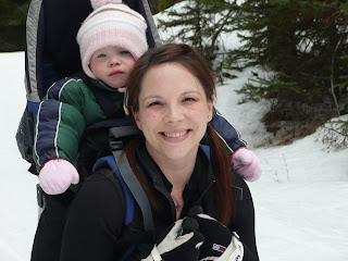
Here's a photo of me and my 2 year old out for a ski. She chatted in my ear happily the entire time we were skiing. Even though she's not smiling in this picture, she really did love it! Next year she'll be too heavy to carry, so she'll ride in a Polk (a sled that you pull behind you when you ski).

6. I'm a very messy housekeeper. If you come to my house and it looks tidy and clean, that's because I'm trying to pretend I'm like everyone else and cleaned my house like mad before you arrived!! If you come over and my house is a mess, that usually means that I'm finished pretending and I'm comfortable with you knowing the horrible truth about me!!

7. I like acting on stage. Started that in highschool. I was a shy, quiet kid who wanted to be an artist. I took art classed in grade 8, but the program in our school forced you to do half a year in art and half a year in drama. I won an award for drama and wasn't recognised for my artwork, so I took drama in grade 9, 10, 11, and 12!! Sorry to say my drawing abilities have gone downhill, but I still am involved in drama in my church. I've always loved the idea of being in a community theatre production, but most often, it seems, they do musicals, and I CAN'T SING!!

So, there you have it. My seven facts.

I have some cards to show you soon. Just have to take some pictures of them first.

Thursday, March 27, 2008

Upcoming blog candy!!

I know I haven't been very active on my blog site. I apologize for that. My pregnancy has been a bit rough this first trimester with nausea and fatigue, so my stamping activities have been affected.

I have good news! I will be posting some great blog candy when my blog hits 3000! There will be a Stampin' Up stamp set among the loot, plus a few extras! So keep visiting because you won't want to miss it!

I promise to put up a new project soon for you to check out as well. Remember to comment on what you see if you like it. It will spur me on to show you more projects. I will feel like my time is well spent with each comment I receive from you.

Thursday, March 13, 2008

Faux Silk Pocket Card

This is a lovely technique that is really very simple. I'm very pleased with how this card turned out. I made it for my faithful customer and friend, Gwen, as a make-and-take project for her stampin' party with my other most faithful customers and friends!! Gwen requested a pocket card with a book mark inside. This is what I came up with.

I decribe in brief how to do the faux silk technique on a previous post. For this one, I used my new Pretty Petals background stamp and inked it using Stampin' Up markers. Once inked, I huffed my breath over the inked stamp before stamping it on my tissue paper to re-moisten the ink. The base of my card is made with kraft cardstock (I've been using that a lot lately). I also used purely pomegranate, groovy guava, and whisper white cardstock. The "thank you" is done with one of the new rub-on's from Stampin' Up. Of course, the background stamp was also used on the kraft paper, but done in Versamark ink for a subtle look.


The bookmark was made with the same colours and techniques. I used a jumbo eyelet at the top to put the bravo burgandy and double stitched groovy guava grosgrain ribbon through. The "happiness" was stamped using my ABC lower alphabet set and heat embossed with white embossing powder.


This card has a number of steps. I won't explain them all unless you have questions as it would be an aweful lot.

Hope you like my card and bookmark!

Friday, February 29, 2008

For My Valentine

I made this card for my DH on Valentine's Day. I needed it to be relatively simple as I started it that morning and wanted to finish before he woke up. I had to do a do-over with the buckle chipboard once, because I bent it and smudged the ink...the joys of working with the slower drying craft ink!


I used the Kraft paper for the base. The chipboard buckle and heart are from Stampin' Up's On Board chipboard. I started by using Whisper White craft ink to cover the buckle. I did it a couple times, heat setting it with my heat gun in between coats (it still doesn't completely set this way, but it helps reduce mess, oh, and it smoked just a little bit...hehe). Once I was satisfied that it wouldn't get any whiter, I used my Real Red craft ink and the hearts stamp from the hostess set "A Little Bit of Happiness" to apply over the white ink, then I clear embossed over that so that the red inked image became raised and shiny (hard to see in this photo). The heart was inked thoroughly with the real red craft ink and clear embossed twice to give a glossy finish. This changes the true red color a bit, so I opted for the Bravo Burgandy 1/4" grosgrain ribbon to attach the buckle to the card (I also secured the buckle to the paper with some Sticky Strip). The heart was attached to the cardstock with a couple Stampin' Dimensionals. I used a favorite retired stamp inside the card with the sentiment: "I love you more today than yesterday, but less today than I will tomorrow".